7 mistakes that drive customers away from your website (I see number 2 almost everywhere)
Your website gets visits, but the phone doesn’t ring? The 7 mistakes I see most often on small business websites, and how to fix each one.

In this article· 8 sections
Someone searches Google for “kitesurf lessons Rhodes” or “lawyer Rhodes”. They find your website, look around for ten seconds and leave. No call, no message. You never find out. You just say, at some point: “my website doesn’t bring me anything.”
When people ask me to look at a website that “doesn’t bring in work”, the colours or the logo are rarely to blame. It’s almost always small, boring things, and most of them are quick to fix. These are the seven I see most often. You don’t need to know anything technical to check them: your phone is enough.
1. The first screen doesn’t say what you do
“Welcome to our website.” A slider with three photos that change on their own. A slogan like “Quality and consistency since 1998”. All very nice, but the visitor still doesn’t know whether you’re a garage, an accountant or a taverna.
The moment the page opens, the visitor wants to understand three things: what you do, where, and what to tap next. If they have to scroll to find out, many won’t.
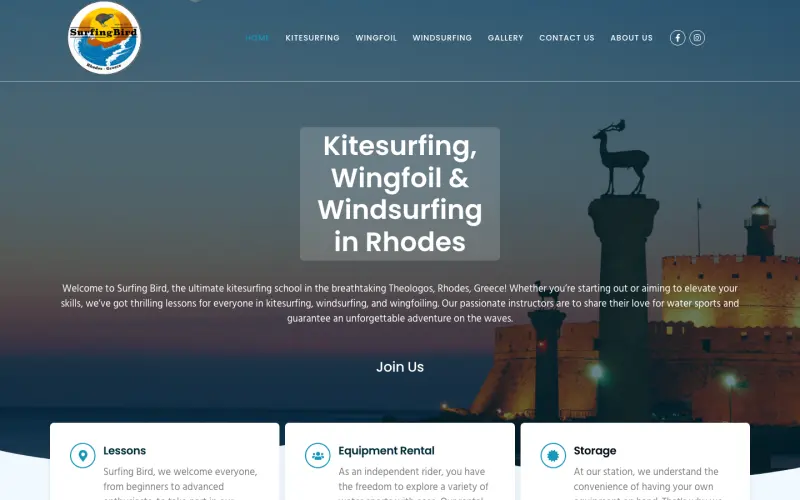
At Surfing Bird, a water-sports school in Rhodes, the headline on the first screen is simply the three sports and the island. No poetry. Anyone looking for kitesurfing in Rhodes knows straight away they’ve found it.
2. The phone number doesn’t “tap”
This is the one I see almost everywhere. The number is there, somewhere at the very bottom of the page, written as plain text or, worse, inside an image. A visitor on a phone has to memorise it, leave the browser and type it in digit by digit.
You lost them somewhere around the third digit.
On a phone, your number should call with one tap. For a developer it’s a single line of code, and yet it’s missing from a huge number of websites. The same goes for your email, your address, and WhatsApp or Viber if you talk to customers there.
- The number only at the bottom of the page
- Written inside an image or banner
- Plain text that doesn’t call when tapped
- Only a contact form, no phone at all
- Phone at the top or in the menu, on every page
- Calls with one tap
- Email opens the mail app
- Address opens the map with directions
3. You hide your prices
“Contact us for prices.” I get it, every job is different. But the visitor reads it differently: “expensive”, or “they’ll keep me on the phone for ages”. And they move on to the next business, the one with a price list.
You don’t have to give an exact quote. A “from”, a range, or even what affects the price is enough to keep them on the page and asking about the rest. Surfing Bird, for example, has a detailed price list for every lesson and for equipment rental.
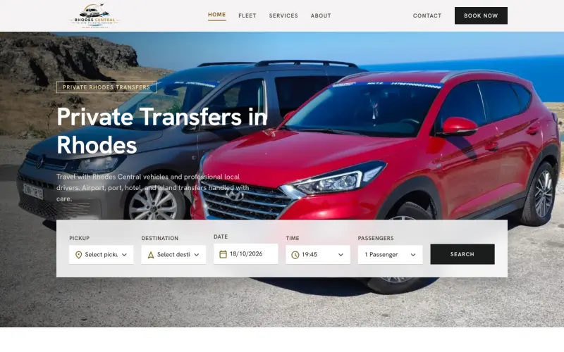
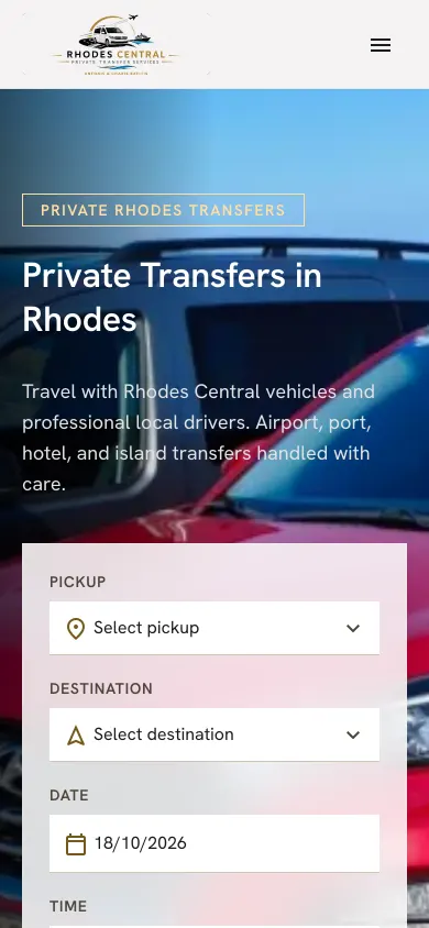
With Rhodes Central I took it a step further. Travellers choose where from, where to and when, right on the first screen, and see the price and available vehicles straight away. No phone calls, no “we’ll get back to you”.
4. Photos that don’t show you
The smiling team in suits around a laptop. Two hands shaking. You’ve seen them on a hundred websites, and so has your visitor. Stock photos convince nobody, because they show nothing of yours.
The other extreme is photos from 2014, blurry, taken on the phone of the day. And the customer thinks: if they don’t look after their website, do they look after their work?
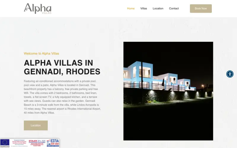
A few real, good photos always win. Your place, your products, you. For holiday rentals that’s everything, because guests decide from the photos. That’s why at Alpha Villas the villa is shown as it really is, large, on the first screen.
5. It’s slow on mobile
The customer taps the link, sees a white screen, waits, leaves. According to Google research (2016), more than half of mobile visits are abandoned when a page takes longer than three seconds to load.
The usual suspects: photos straight from the camera, dozens of plugins, and chat widgets or pop-ups that load before the content itself. I’ve written a whole article on this, with steps to measure your own page: Is your website slow on mobile?
6. It only speaks Greek (or only English)
In Rhodes, in summer, many of your customers don’t read Greek. A taverna, a boat rental or a holiday let with a Greek-only website simply doesn’t exist for them. And the other way round: a lawyer or an accountant with an English-only website feels foreign to their local clients.
And, if you can, skip the automatic translation button. The text it produces reads like a translation from the first sentence, and with many of these plugins the translation only happens in the visitor’s browser, so Google never even sees it.
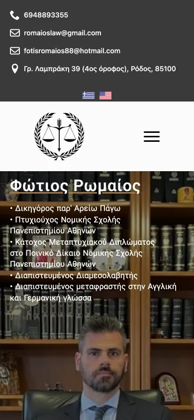
The right way is two proper versions of the page, written by a person and declared correctly to Google, so everyone finds their own language. That’s how the Fotios Romaios website is built, and this one too: tap EL at the top of the page and you’ll see this same article in Greek.
7. The visitor doesn’t know what to do next
Let’s say you got everything right. The visitor understood what you do, liked the photos, saw prices. Now what? If the next step isn’t obvious, they’ll close the tab “to look at it later”.
They won’t.
Every page needs one main button, with a verb that says what happens: “Book an appointment”, “Check availability”, “Call now”. Not five buttons competing with each other, and not a form with twelve fields. For a first message, a name, a phone number or email and a couple of lines are enough.
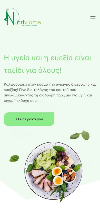
The next step isn’t the same for everyone. A lawyer wants you to call, a dietitian wants you to book, a transfer company wants you to reserve. What matters is that it’s visible on the first screen of a phone:
Run the check now, on your phone
You don’t need tools or a developer. You need ten minutes and someone who doesn’t know your business.
The ten-minute check
- Open the page off Wi‑FiOn mobile data, the way a customer would open it out and about. Did it load quickly? Is it obvious what you do?
- Hand your phone to a friendAsk them to find a price and your phone number. Don’t help. Time how long it takes.
- Tap your own numberIf the call doesn’t start, you’ve just found the first thing worth fixing.
If you recognised even one of these seven on your own website, you’re not alone. Most of them can be fixed without building a new website from scratch.
If you’d like a second pair of eyes, send me your website’s address. I’ll open it on my phone, the way your customers will, and tell you honestly what’s worth changing and what isn’t. The first conversation is free, and I reply within one working day.
Found it useful? Share it
Keep reading
- AI wrote your app. Do you know what it forgot to tell you?I checked 105 public AI-built apps and the code mostly looked fine. The real risk is what doesn’t show: six things AI won’t tell you before you launch.
- A PHP flaw lets attackers into your server without a password. Are you at risk?PHP2Shell: two critical PHP flaws leaked on 20 October and were fixed on 21 October. Who is at risk, how to check your WordPress site and how to fix it.